Network diagram at full stretch: eight colour-coded lines
Mini Metro · Campaign / World Map
Art style Minimalist & vector
About this game
Developer: Dinosaur Polo Club · Publisher: Dinosaur Polo Club · Platform: PC (Steam) · Art style: Minimalist & vector · Screen type: Campaign / World Map
More Mini Metro screens in the Gallery
What to study
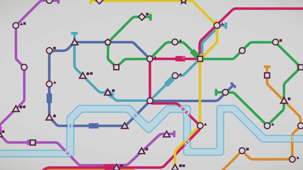
Mini Metro's whole interface is a transit diagram, and this frame is the design in one image: colour names the line, shape names the station, and a passenger is just a small solid copy of the shape they want to reach, so the entire simulation state (network, demand, trains in transit) reads with no text, no numbers and no legend. Even geography is reduced to one fact, the pale river ribbon, with dashed segments where lines cross it. The frame is a manual extraction at about 0:53 in the Launch Trailer (Steam), a staged trailer animation rendered in the game's exact visual system rather than a HUD-on capture; the camera move crops the network at the edges, disclosed in the elements, but the diagram language on show is the shipped game's, unchanged. Inspected at full resolution (1280x720) in this prep.
Patterns
How the screen is arranged.
map-icons minimal-hud route-planning
Components
Parts on screen.
Screen inventory
- eight lines told apart by colour alone, magenta, yellow, green, two blues, purple, orange-red, drawn in the rounded right-angle bends of a Beck-style transit diagram over a plain grey ground; no street map, no labels, no legend
- stations as hollow shape glyphs in one dark plum: circles (common), triangles, squares, plus rarities at the frame edges, a pentagon (upper left-centre), a diamond (top centre), a star (top centre-right), the shape is the station's identity and its name
- passengers as tiny solid versions of the same shapes queued beside stations: a triangle and a square dot at the left-hand circle station, a dot and two squares at the large triangle mid-left, single dots/triangles scattered at a dozen more, demand is read as 'how many of which shape are waiting where'
- trains as solid line-coloured rectangles mid-route, each carrying one lighter square, a passenger on board: green train upper centre, yellow train upper right, light-blue train centre, dark-blue train crossing the river, magenta trains low centre and centre-right
- the river as a wide pale-blue ribbon looping across the lower half (the Thames); lines cross it on short dashed segments, the tunnel/bridge crossing convention, while everything else about geography is erased
- interchanges need no icon of their own: where lines cross at a shared glyph (the square station upper right-centre joining magenta/yellow/green/light-blue, the circle lower centre joining four lines) the single shape serves every line
Top 3 colors
#d6d6d6 40%#cdd1d1 21%#a59aa0 16%
Top three palette colors by share. The remaining colors make up the rest.
Source and credit
© Dinosaur Polo Club, Mini Metro screenshot: Mini Metro - Launch Trailer video (Steam), shown for design study and commentary. PlayCraft is an unofficial fan project, not affiliated with or endorsed by Dinosaur Polo Club.
Source tier 2 (publisher-released) · screenshot: Steam store page · Steam page
Source details
Fetched 2026-10-21. verified 2026-10-21: manual extraction at 53.5s (accurate seek, probes/verify/t53.5.png) inspected visually at full resolution (1280x720) in this prep; keeper file network-map-river.png is a byte copy of that extraction (via probes/network-map-p53.5.png)
no published policy found (checked 2026-10-21); fair-use study use, takedown honored within 48h
Rights holders: see Copyright & takedown.


Similar screens
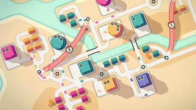 Mini Motorways - Dubai in the day: pin-counted destinations, two motorways
Same type: Campaign / World Map; Shared patterns: route-planning, minimal-hud, map-icons
 Mini Motorways - Manila: one motorway across the Pasig, a working roundabout
Same type: Campaign / World Map; Shared patterns: route-planning, minimal-hud
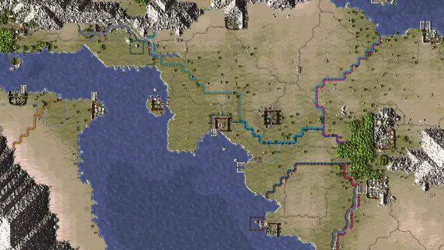 Songs of Syx - World map: dashed territory borders and settlement icons
Same type: Campaign / World Map; Shared patterns: map-icons, minimal-hud
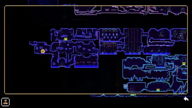 ANIMAL WELL - Exploration map: explored rooms, player marker, and candle markers
Same type: Campaign / World Map; Shared patterns: map-icons, minimal-hud
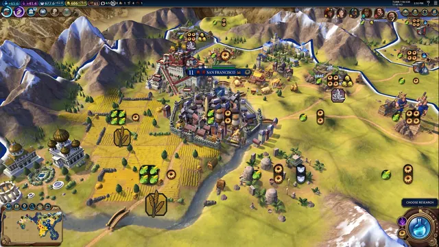 Civilization VI - Campaign map with tile yields
Same type: Campaign / World Map; Shared patterns: map-icons
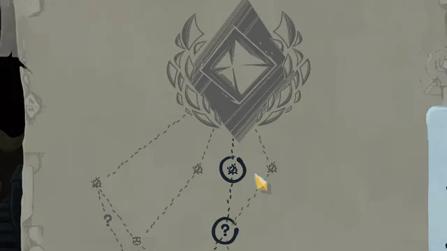 Slay the Spire - Route map: branching paths to the act boss
Same type: Campaign / World Map; Shared patterns: route-planning